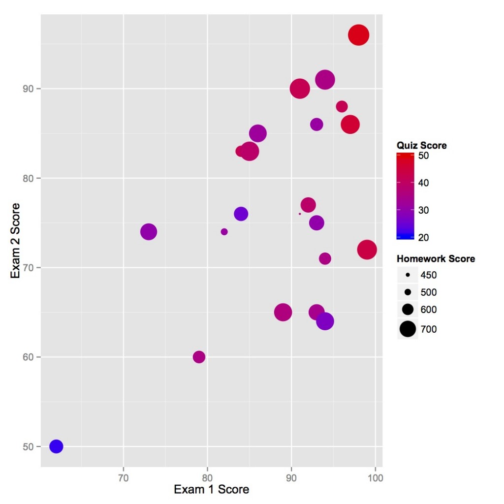
Lots of data on this plot: for each student you can read his/her exam scores, homework grades, and quiz grades.
I had some success recently in demonstrating to my students that their performance on the exams of a course is at least correlated with their performance on homework and quizzes. The figure above is from my fall 2012 nuclear reactor theory course. As it is obvious, those who did better on exam 1 were likely to perform well on exam 2. Also, the big dots, high homework scores, are likely to be in the top right as well.
Those students who did not get the point of this figure after some explanation at least had some fun pointing out their dot on the figure.
The following will demonstrate how I made this figure using R and the ggplot2 (Grammar of Graphics 2) package. Hit the jump to see more.