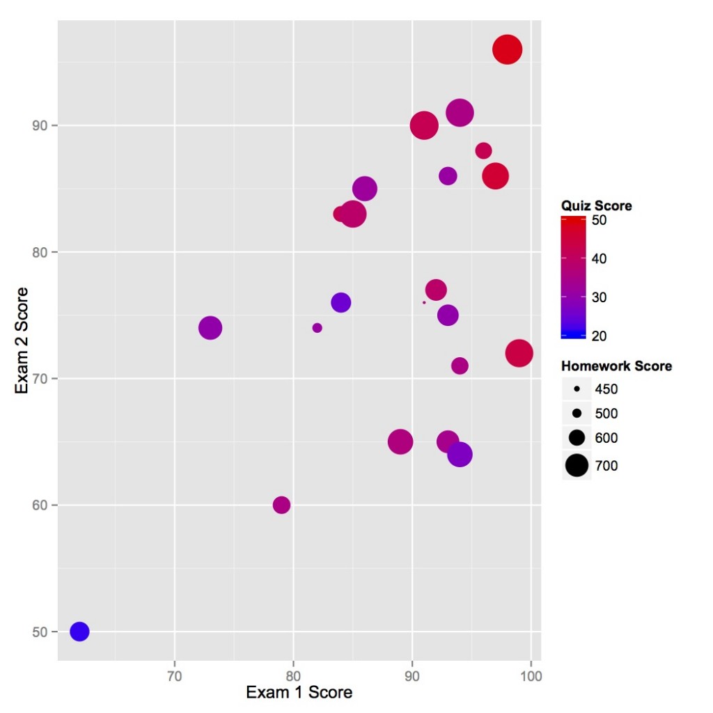
Lots of data on this plot: for each student you can read his/her exam scores, homework grades, and quiz grades.
I had some success recently in demonstrating to my students that their performance on the exams of a course is at least correlated with their performance on homework and quizzes. The figure above is from my fall 2012 nuclear reactor theory course. As it is obvious, those who did better on exam 1 were likely to perform well on exam 2. Also, the big dots, high homework scores, are likely to be in the top right as well.
Those students who did not get the point of this figure after some explanation at least had some fun pointing out their dot on the figure.
The following will demonstrate how I made this figure using R and the ggplot2 (Grammar of Graphics 2) package. Hit the jump to see more.
The grades for this figure (without names of course) can be found in this file. First load the data is loaded in R and load the ggplot2 package. I loaded the data using
grades <- read.csv('~/Downloads/NoNames.csv')
Then by typing (sorry about the wonky column names)
ggplot(grades, aes(x = Exam.1...Total, y=Exam.2.Total, color = QuizScore, size = HomeworkScore)) + geom_point() +scale_size("Homework Score",range=c(1,10),breaks=c(450,500,600,700)) + scale_colour_gradient('Quiz Score',low="blue", high="red",limits=c(20,50)) + xlab('Exam 1 Score') + ylab('Exam 2 Score')
you will get the above figure. Now let’s delve a bit into what the above command is doing. The first command
ggplot(grades, aes(x = Exam.1...Total, y=Exam.2.Total, color = QuizScore, size = HomeworkScore))
tells ggplot that the data to use for the figure is called grades, and the x-axis should be the column Exam.1…Total and the y-axis should be column Exam.2.Total. It also says that the color in the figure should be determined by the student’s QuizScore (the total of his/her scores on quizzes) and the size of the dot determined by the student’s HomeworkScore (the total score on homework).
The next piece of the command tells ggplot that we want a scatterplot of points (i.e., the geometry in the plot to be points)
geom_point()
The next two parts of the command tell ggplot how to scale the color and the size of the points in the graph. Specifically that we want the size of the points to range from 1 to 10 and the label on the graph to include 450, 500, 600, and 700 for HomeworkScore, and that for the color scale we want to use a gradient with the low value of the QuizScore to be 20 and have a blue color and have the high score be 50 with a color of red with a gradient in between.
scale_size("Homework Score",range=c(1,10),breaks=c(450,500,600,700)) + scale_colour_gradient('Quiz Score',low="blue", high="red",limits=c(20,50))
These commands also tell ggplot what to name the scales: Homework Score and Quiz Score instead of the less-than-elegant column names.
Finally, we rename the x and y axes:
xlab('Exam 1 Score') + ylab('Exam 2 Score')
That’s all there is to it.
By the way, I did try to build a linear model to predict Exam 2 score based on the variables available before the exam using the simple regression model fit in R using
summary(lm(Exam.2.Total ~ HomeworkScore + QuizScore + Exam.1...Total,data=grades))
The Quiz score is significant with a p value of less than 0.05, whereas the Exam 1 score is less significant. I guess some students took there first exam grade as a wakeup call and others got complacent. Also, the standard error in the model was 9 points so I can’t replace the second exam with an equation unless I want to be off by about a whole letter grade.